Best Login and Signup Forms using HTML, CSS and JS
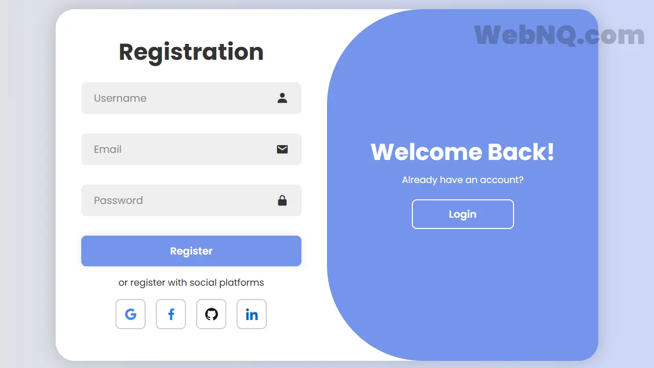
1. Sleek two‑panel Login/Signup form
This guide shows how to create a sleek two‑panel Login/Signup form that toggles with a smooth animation, adapts to mobile screens, and follows accessibility best practices for labels and errors. The approach uses semantic HTML, CSS transitions, and a minimal script to switch panels, keeping performance and usability front and center. It also includes SEO tips and lightweight asset choices to support discoverability and Core Web Vitals.
HTML
<!DOCTYPE html>
<html lang="en">
  <head>
    <meta charset="UTF-8" />
    <meta name="viewport" content="width=device-width, initial-scale=1.0" />
    <title>Login/Signup Form | @coding.stella</title>
    <link rel="stylesheet" href="style.css" />
    <link
      href="https://unpkg.com/boxicons@2.1.4/css/boxicons.min.css"
      rel="stylesheet"
    />
  </head>
  <body>
    <div class="container">
      <div class="form-box login">
        <form action="#">
          <h1>Login</h1>
          <div class="input-box">
            <input type="text" placeholder="Username" required />
            <i class="bx bxs-user"></i>
          </div>
          <div class="input-box">
            <input type="password" placeholder="Password" required />
            <i class="bx bxs-lock-alt"></i>
          </div>
          <div class="forgot-link">
            <a href="#">Forgot Password?</a>
          </div>
          <button type="submit" class="btn">Login</button>
          <p>or login with social platforms</p>
          <div class="social-icons">
            <a href="#"><i class="bx bxl-google"></i></a>
            <a href="#"><i class="bx bxl-facebook"></i></a>
            <a href="#"><i class="bx bxl-github"></i></a>
            <a href="#"><i class="bx bxl-linkedin"></i></a>
          </div>
        </form>
      </div>

      <div class="form-box register">
        <form action="#">
          <h1>Registration</h1>
          <div class="input-box">
            <input type="text" placeholder="Username" required />
            <i class="bx bxs-user"></i>
          </div>
          <div class="input-box">
            <input type="email" placeholder="Email" required />
            <i class="bx bxs-envelope"></i>
          </div>
          <div class="input-box">
            <input type="password" placeholder="Password" required />
            <i class="bx bxs-lock-alt"></i>
          </div>
          <button type="submit" class="btn">Register</button>
          <p>or register with social platforms</p>
          <div class="social-icons">
            <a href="#"><i class="bx bxl-google"></i></a>
            <a href="#"><i class="bx bxl-facebook"></i></a>
            <a href="#"><i class="bx bxl-github"></i></a>
            <a href="#"><i class="bx bxl-linkedin"></i></a>
          </div>
        </form>
      </div>

      <div class="toggle-box">
        <div class="toggle-panel toggle-left">
          <h1>Hello, Welcome!</h1>
          <p>Don't have an account?</p>
          <button class="btn register-btn">Register</button>
        </div>

        <div class="toggle-panel toggle-right">
          <h1>Welcome Back!</h1>
          <p>Already have an account?</p>
          <button class="btn login-btn">Login</button>
        </div>
      </div>
    </div>

    <script src="./script.js"></script>
  </body>
</html>
CSS
@import url("https://fonts.googleapis.com/css2?family=Poppins:ital,wght@0,100;0,200;0,300;0,400;0,500;0,600;0,700;0,800;0,900;1,100;1,200;1,300;1,400;1,500;1,600;1,700;1,800;1,900&display=swap");

* {
  margin: 0;
  padding: 0;
  box-sizing: border-box;
  font-family: "Poppins", sans-serif;
  text-decoration: none;
  list-style: none;
}

body {
  display: flex;
  justify-content: center;
  align-items: center;
  min-height: 100vh;
  background: linear-gradient(90deg, #e2e2e2, #c9d6ff);
}

.container {
  position: relative;
  width: 850px;
  height: 550px;
  background: #fff;
  margin: 20px;
  border-radius: 30px;
  box-shadow: 0 0 30px rgba(0, 0, 0, 0.2);
  overflow: hidden;
}

.container h1 {
  font-size: 36px;
  margin: -10px 0;
}

.container p {
  font-size: 14.5px;
  margin: 15px 0;
}

form {
  width: 100%;
}

.form-box {
  position: absolute;
  right: 0;
  width: 50%;
  height: 100%;
  background: #fff;
  display: flex;
  align-items: center;
  color: #333;
  text-align: center;
  padding: 40px;
  z-index: 1;
  transition:
    0.6s ease-in-out 1.2s,
    visibility 0s 1s;
}

.container.active .form-box {
  right: 50%;
}

.form-box.register {
  visibility: hidden;
}
.container.active .form-box.register {
  visibility: visible;
}

.input-box {
  position: relative;
  margin: 30px 0;
}

.input-box input {
  width: 100%;
  padding: 13px 50px 13px 20px;
  background: #eee;
  border-radius: 8px;
  border: none;
  outline: none;
  font-size: 16px;
  color: #333;
  font-weight: 500;
}

.input-box input::placeholder {
  color: #888;
  font-weight: 400;
}

.input-box i {
  position: absolute;
  right: 20px;
  top: 50%;
  transform: translateY(-50%);
  font-size: 20px;
}

.forgot-link {
  margin: -15px 0 15px;
}
.forgot-link a {
  font-size: 14.5px;
  color: #333;
}

.btn {
  width: 100%;
  height: 48px;
  background: #7494ec;
  border-radius: 8px;
  box-shadow: 0 0 10px rgba(0, 0, 0, 0.1);
  border: none;
  cursor: pointer;
  font-size: 16px;
  color: #fff;
  font-weight: 600;
}

.social-icons {
  display: flex;
  justify-content: center;
}

.social-icons a {
  display: inline-flex;
  padding: 10px;
  border: 2px solid #ccc;
  border-radius: 8px;
  font-size: 24px;
  color: #333;
  margin: 0 8px;
}

.toggle-box {
  position: absolute;
  width: 100%;
  height: 100%;
}

.toggle-box::before {
  content: "";
  position: absolute;
  left: -250%;
  width: 300%;
  height: 100%;
  background: #7494ec;
  /* border: 2px solid red; */
  border-radius: 150px;
  z-index: 2;
  transition: 1.8s ease-in-out;
}

.container.active .toggle-box::before {
  left: 50%;
}

.toggle-panel {
  position: absolute;
  width: 50%;
  height: 100%;
  /* background: seagreen; */
  color: #fff;
  display: flex;
  flex-direction: column;
  justify-content: center;
  align-items: center;
  z-index: 2;
  transition: 0.6s ease-in-out;
}

.toggle-panel.toggle-left {
  left: 0;
  transition-delay: 1.2s;
}
.container.active .toggle-panel.toggle-left {
  left: -50%;
  transition-delay: 0.6s;
}

.toggle-panel.toggle-right {
  right: -50%;
  transition-delay: 0.6s;
}
.container.active .toggle-panel.toggle-right {
  right: 0;
  transition-delay: 1.2s;
}

.toggle-panel p {
  margin-bottom: 20px;
}

.toggle-panel .btn {
  width: 160px;
  height: 46px;
  background: transparent;
  border: 2px solid #fff;
  box-shadow: none;
}

@media screen and (max-width: 650px) {
  .container {
    height: calc(100vh - 40px);
  }

  .form-box {
    bottom: 0;
    width: 100%;
    height: 70%;
  }

  .container.active .form-box {
    right: 0;
    bottom: 30%;
  }

  .toggle-box::before {
    left: 0;
    top: -270%;
    width: 100%;
    height: 300%;
    border-radius: 20vw;
  }

  .container.active .toggle-box::before {
    left: 0;
    top: 70%;
  }

  .container.active .toggle-panel.toggle-left {
    left: 0;
    top: -30%;
  }

  .toggle-panel {
    width: 100%;
    height: 30%;
  }
  .toggle-panel.toggle-left {
    top: 0;
  }
  .toggle-panel.toggle-right {
    right: 0;
    bottom: -30%;
  }

  .container.active .toggle-panel.toggle-right {
    bottom: 0;
  }
}

@media screen and (max-width: 400px) {
  .form-box {
    padding: 20px;
  }

  .toggle-panel h1 {
    font-size: 30px;
  }
}

/* --- Social Icons Brand Colors --- */
.social-icons a .bxl-google {
  color: #4285F4;   /* Google Blue */
}

.social-icons a .bxl-facebook {
  color: #1877F2;   /* Facebook Blue */
}

.social-icons a .bxl-github {
  color: #181717;   /* GitHub Black */
}

.social-icons a .bxl-linkedin {
  color: #0A66C2;   /* LinkedIn Blue */
}
JavaScript
const container = document.querySelector('.container');
const registerBtn = document.querySelector('.register-btn');
const loginBtn = document.querySelector('.login-btn');
registerBtn.addEventListener('click', () => {
container.classList.add('active');
})
loginBtn.addEventListener('click', () => {
container.classList.remove('active');
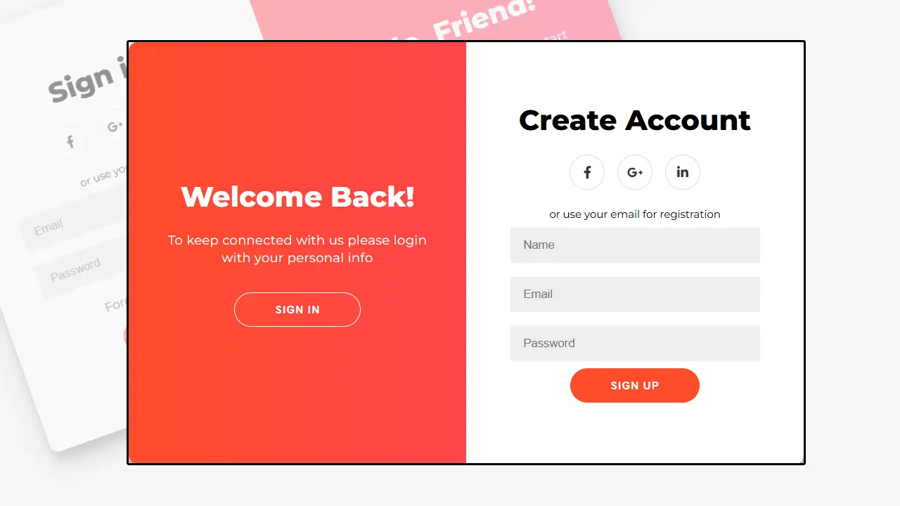
})2. Sign in/up Form style
HTML
<h2>Sign in/up Form</h2>
<div class="container" id="container">
	<div class="form-container sign-up-container">
		<form action="#">
			<h1>Create Account</h1>
			<div class="social-container">
				<a href="#" class="social"><i class="fab fa-facebook-f"></i></a>
				<a href="#" class="social"><i class="fab fa-google-plus-g"></i></a>
				<a href="#" class="social"><i class="fab fa-linkedin-in"></i></a>
			</div>
			<span>or use your email for registration</span>
			<input type="text" placeholder="Name" />
			<input type="email" placeholder="Email" />
			<input type="password" placeholder="Password" />
			<button>Sign Up</button>
		</form>
	</div>
	<div class="form-container sign-in-container">
		<form action="#">
			<h1>Sign in</h1>
			<div class="social-container">
				<a href="#" class="social"><i class="fab fa-facebook-f"></i></a>
				<a href="#" class="social"><i class="fab fa-google-plus-g"></i></a>
				<a href="#" class="social"><i class="fab fa-linkedin-in"></i></a>
			</div>
			<span>or use your account</span>
			<input type="email" placeholder="Email" />
			<input type="password" placeholder="Password" />
			<a href="#">Forgot your password?</a>
			<button>Sign In</button>
		</form>
	</div>
	<div class="overlay-container">
		<div class="overlay">
			<div class="overlay-panel overlay-left">
				<h1>Welcome Back!</h1>
				<p>To keep connected with us please login with your personal info</p>
				<button class="ghost" id="signIn">Sign In</button>
			</div>
			<div class="overlay-panel overlay-right">
				<h1>Hello, Friend!</h1>
				<p>Enter your personal details and start journey with us</p>
				<button class="ghost" id="signUp">Sign Up</button>
			</div>
		</div>
	</div>
</div>
CSS
@import url('https://fonts.googleapis.com/css?family=Montserrat:400,800');

* {
	box-sizing: border-box;
}

body {
	background: #f6f5f7;
	display: flex;
	justify-content: center;
	align-items: center;
	flex-direction: column;
	font-family: 'Montserrat', sans-serif;
	height: 100vh;
	margin: -20px 0 50px;
}

h1 {
	font-weight: bold;
	margin: 0;
}

h2 {
	text-align: center;
}

p {
	font-size: 14px;
	font-weight: 100;
	line-height: 20px;
	letter-spacing: 0.5px;
	margin: 20px 0 30px;
}

span {
	font-size: 12px;
}

a {
	color: #333;
	font-size: 14px;
	text-decoration: none;
	margin: 15px 0;
}

button {
	border-radius: 20px;
	border: 1px solid #FF4B2B;
	background-color: #FF4B2B;
	color: #FFFFFF;
	font-size: 12px;
	font-weight: bold;
	padding: 12px 45px;
	letter-spacing: 1px;
	text-transform: uppercase;
	transition: transform 80ms ease-in;
}

button:active {
	transform: scale(0.95);
}

button:focus {
	outline: none;
}

button.ghost {
	background-color: transparent;
	border-color: #FFFFFF;
}

form {
	background-color: #FFFFFF;
	display: flex;
	align-items: center;
	justify-content: center;
	flex-direction: column;
	padding: 0 50px;
	height: 100%;
	text-align: center;
}

input {
	background-color: #eee;
	border: none;
	padding: 12px 15px;
	margin: 8px 0;
	width: 100%;
}

.container {
	background-color: #fff;
	border-radius: 10px;
  	box-shadow: 0 14px 28px rgba(0,0,0,0.25),
			0 10px 10px rgba(0,0,0,0.22);
	position: relative;
	overflow: hidden;
	width: 768px;
	max-width: 100%;
	min-height: 480px;
}

.form-container {
	position: absolute;
	top: 0;
	height: 100%;
	transition: all 0.6s ease-in-out;
}

.sign-in-container {
	left: 0;
	width: 50%;
	z-index: 2;
}

.container.right-panel-active .sign-in-container {
	transform: translateX(100%);
}

.sign-up-container {
	left: 0;
	width: 50%;
	opacity: 0;
	z-index: 1;
}

.container.right-panel-active .sign-up-container {
	transform: translateX(100%);
	opacity: 1;
	z-index: 5;
	animation: show 0.6s;
}

@keyframes show {
	0%, 49.99% {
		opacity: 0;
		z-index: 1;
	}

	50%, 100% {
		opacity: 1;
		z-index: 5;
	}
}

.overlay-container {
	position: absolute;
	top: 0;
	left: 50%;
	width: 50%;
	height: 100%;
	overflow: hidden;
	transition: transform 0.6s ease-in-out;
	z-index: 100;
}

.container.right-panel-active .overlay-container{
	transform: translateX(-100%);
}

.overlay {
	background: #FF416C;
	background: -webkit-linear-gradient(to right, #FF4B2B, #FF416C);
	background: linear-gradient(to right, #FF4B2B, #FF416C);
	background-repeat: no-repeat;
	background-size: cover;
	background-position: 0 0;
	color: #FFFFFF;
	position: relative;
	left: -100%;
	height: 100%;
	width: 200%;
  	transform: translateX(0);
	transition: transform 0.6s ease-in-out;
}

.container.right-panel-active .overlay {
  	transform: translateX(50%);
}

.overlay-panel {
	position: absolute;
	display: flex;
	align-items: center;
	justify-content: center;
	flex-direction: column;
	padding: 0 40px;
	text-align: center;
	top: 0;
	height: 100%;
	width: 50%;
	transform: translateX(0);
	transition: transform 0.6s ease-in-out;
}

.overlay-left {
	transform: translateX(-20%);
}

.container.right-panel-active .overlay-left {
	transform: translateX(0);
}

.overlay-right {
	right: 0;
	transform: translateX(0);
}

.container.right-panel-active .overlay-right {
	transform: translateX(20%);
}

.social-container {
	margin: 20px 0;
}

.social-container a {
	border: 1px solid #DDDDDD;
	border-radius: 50%;
	display: inline-flex;
	justify-content: center;
	align-items: center;
	margin: 0 5px;
	height: 40px;
	width: 40px;
}

footer {
    background-color: #222;
    color: #fff;
    font-size: 14px;
    bottom: 0;
    position: fixed;
    left: 0;
    right: 0;
    text-align: center;
    z-index: 999;
}

footer p {
    margin: 10px 0;
}

footer i {
    color: red;
}

footer a {
    color: #3c97bf;
    text-decoration: none;
}
JavaScript
const signUpButton = document.getElementById('signUp');
const signInButton = document.getElementById('signIn');
const container = document.getElementById('container');

signUpButton.addEventListener('click', () => {
	container.classList.add("right-panel-active");
});

signInButton.addEventListener('click', () => {
	container.classList.remove("right-panel-active");
});
How it works
The layout uses a centered container holding two form panels one for login and one for registration—while a toggle section flips a state class to animate between them. CSS transitions and positioning handle the slide effect, and media queries restructure the layout for smaller viewports without sacrificing clarity. A few lines of JavaScript listen for button clicks and add or remove a class on the container to trigger the animation.
Accessibility tips
Use visible labels for every input because placeholders alone are harmful to comprehension and accessibility as they disappear on entry. Connect each label with its input using for and id, and mark required fields clearly both visually and programmatically. When adding helper text or errors, link them with aria-describedby so assistive tech announces the right guidance at the right time.
Responsive design
Media queries should collapse the split layout into a comfortable single‑column stack on small screens to improve readability and tap accuracy. Adjust paddings, button sizes, and the toggle panel’s position at breakpoints so the transition remains smooth and controls remain easy to reach. Favor a mobile‑first CSS approach so defaults are lightweight and progressively enhanced for larger screens.
Validation and guidance
Leverage HTML5 constraints like required and type=”email” to get built‑in validation, then progressively enhance messages for clarity and tone. Present specific, inline error messages near fields and ensure they’re programmatically associated so screen readers announce them alongside inputs. Inline validation reduces submit‑fail loops and supports faster completion on both desktop and mobile.
Icons and fonts
Use Boxicons for quick, consistent iconography by including the font CSS and applying bx classes such as bxs-user and bxl-google in the markup. Optimize Google Fonts by minimizing families and weights and following performance guidance to reduce layout shifts and render delays. Keeping icon and font payloads small improves perceived responsiveness and supports SEO via better performance metrics.
Performance pointers
Load only the assets truly needed (icons, weights, and CSS) and prefer caching‑friendly CDNs or self‑hosting for stability and speed. Defer non‑critical resources and avoid heavy scripts so animation and input interactions stay smooth under real‑world network conditions. Small performance wins compound into higher completion rates and better Core Web Vitals.
Backend hookup
Connect form actions to server routes and mirror client rules with server‑side validation for consistency and security. Return concise, field‑specific errors and persist valid input values after a failed submit to cut re‑entry friction. Focus management and accessible error announcements reduce confusion and speed recovery from mistakes.
FAQs
Can placeholders replace labels?
No placeholders should not replace visible labels because they impair usability and accessibility.
How to mark required fields?
Indicate “Required” or an asterisk in the label and use required so both visual and programmatic cues exist.
How does it adapt to mobile?
Media queries switch from split to stacked layouts, preserving legibility and tap targets on phones.
Can icons be changed?
Yes swap Boxicons classes to different brands or styles without altering structure.
Keywords: Top Login and Signup Form, Login and Signup Form using html, css and javascript, Login and Signup Form project, Login and Signup Form code